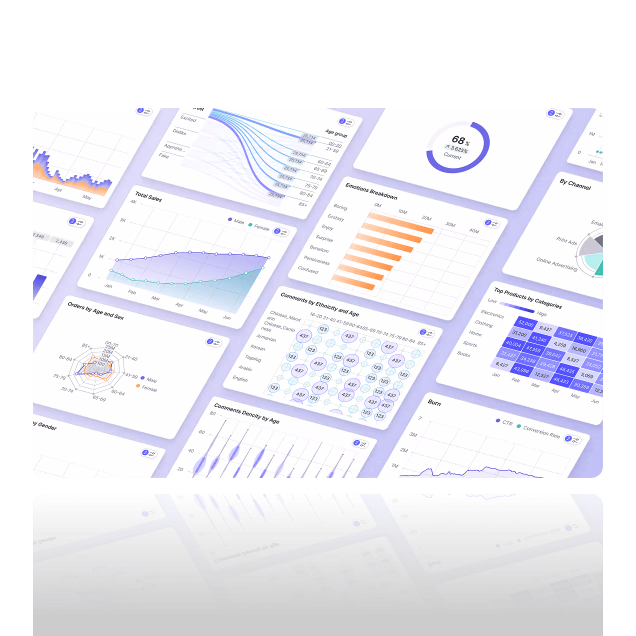

AI Chart Generator for Interactive Charts
Turn raw data into clear visuals your team can understand instantly. Fusedash is an AI chart generator built for fast, decision-ready charting. Start from a CSV or connect an API, then generate charts that are readable, consistent, and ready to use in reporting, analysis, or dashboards. Add filters and comparisons to explain what changed, not just what the numbers are.
Refine charts with labels, tooltips, and clean formatting, then reuse the same dataset across different views as questions change.
What is the Charts Feature?
Fusedash is an AI chart generator that turns datasets into charts you can use right away. Generate the right chart type for trends, comparisons, and distributions, then refine it for reporting and exploration. Keep charts interactive with filters and drilldowns, and reuse them inside dashboards and reports so your visuals stay consistent as your data updates.
For leadership-ready narratives, turn charts into a story.
What is the Charts Feature?
Fusedash is an AI chart generator that turns datasets into charts you can use right away. Generate the right chart type for trends, comparisons, and distributions, then refine it for reporting and exploration. Keep charts interactive with filters and drilldowns, and reuse them inside dashboards and reports so your visuals stay consistent as your data updates.
Interactive Charts for Exploration
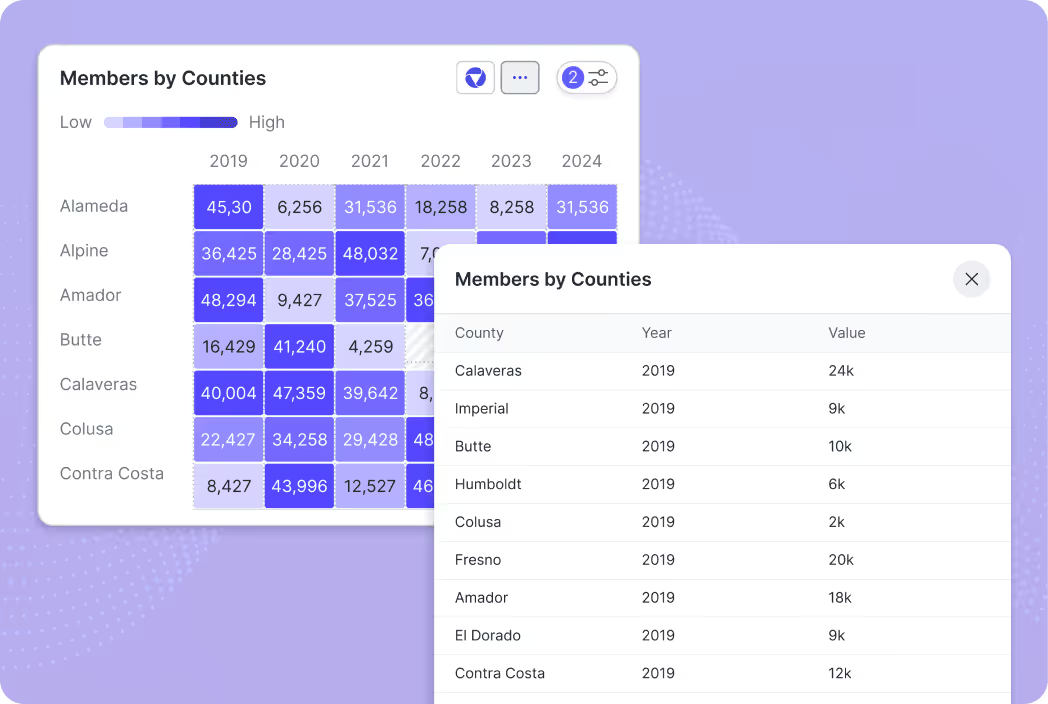
Explore your data with interactive charts that support real investigation. Filter results, compare time periods, and drill into a segment to see the underlying rows in a table view. This makes it easy to move from “something changed” to “where it changed” without rebuilding the chart.
Explore the same interactions inside dashboards.
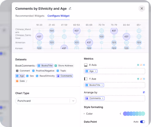
Customize Charts for Clarity
Fine-tune the chart so the message is obvious at a glance. Adjust chart type, axes, aggregation, labels, sorting, and formatting, then keep styles consistent across visuals. You get clean, stakeholder-ready charts without spending hours in chart settings.
Need a complete platform overview? Explore the product.
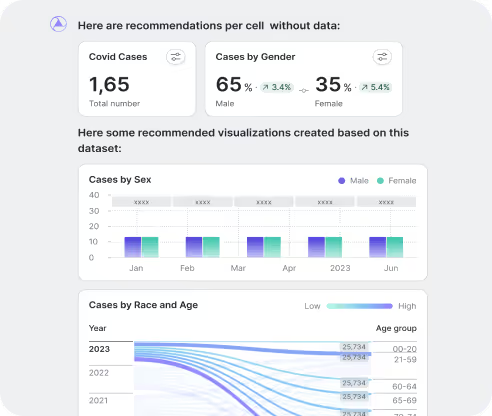
AI insights from your Charts
Get AI suggestions that help you explore faster. Surface recommended visual options for your data, spot unusual spikes or drops, and identify patterns worth investigating. When performance shifts, you can validate what changed and decide what to look at next in minutes.
Prefer to ask in plain language? Try AI Chat.
How to use Interactive Charts
Interactive charts are best when you need answers, not screenshots. Build a chart, filter it by a segment, compare time periods, and drill into what changed. Then reuse the same chart inside dashboards and reports so the visual stays consistent as data updates.
How to use Interactive Charts
Interactive charts are best when you need answers, not screenshots. Build a chart, filter it by a segment, compare time periods, and drill into what changed. Then reuse the same chart inside dashboards and reports so the visual stays consistent as data updates.
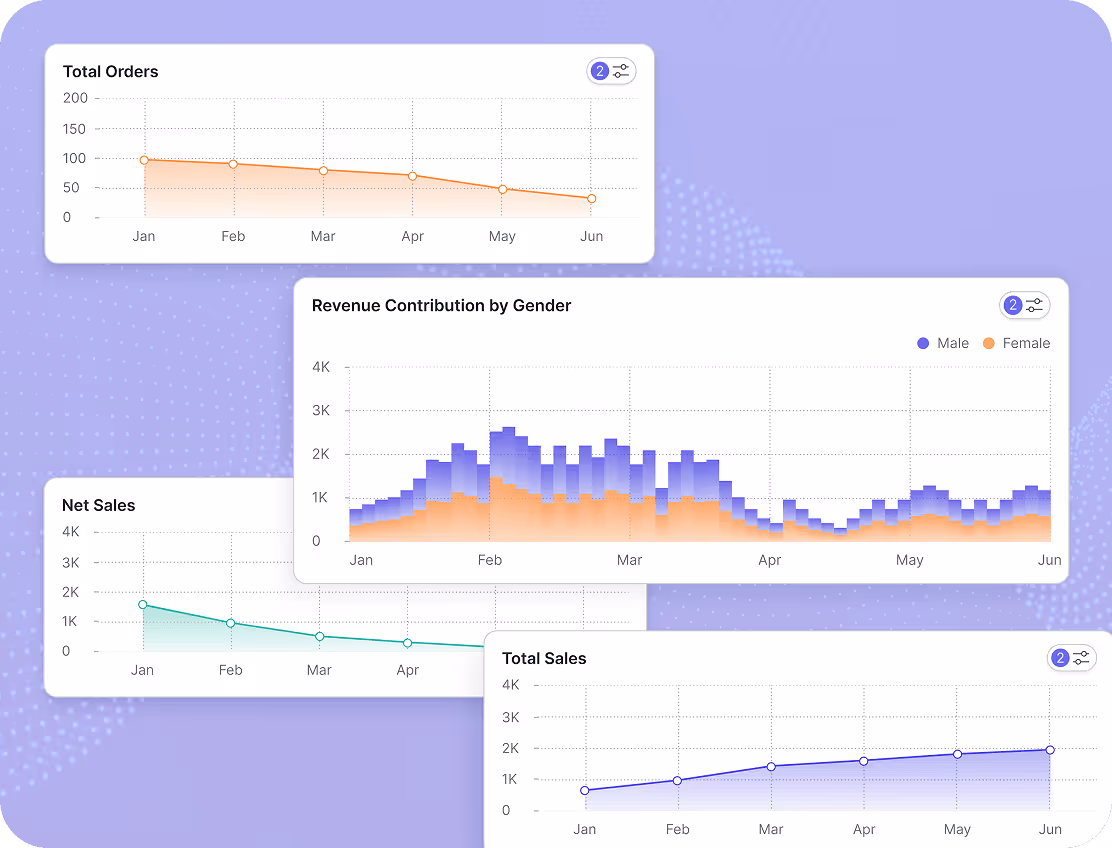
Sales Performance Tracking
Track revenue, orders, and pipeline trends with charts that update by time period, product, and region. Use comparisons and segments to spot seasonality, see where performance shifted, and identify which product or market is driving growth or decline.
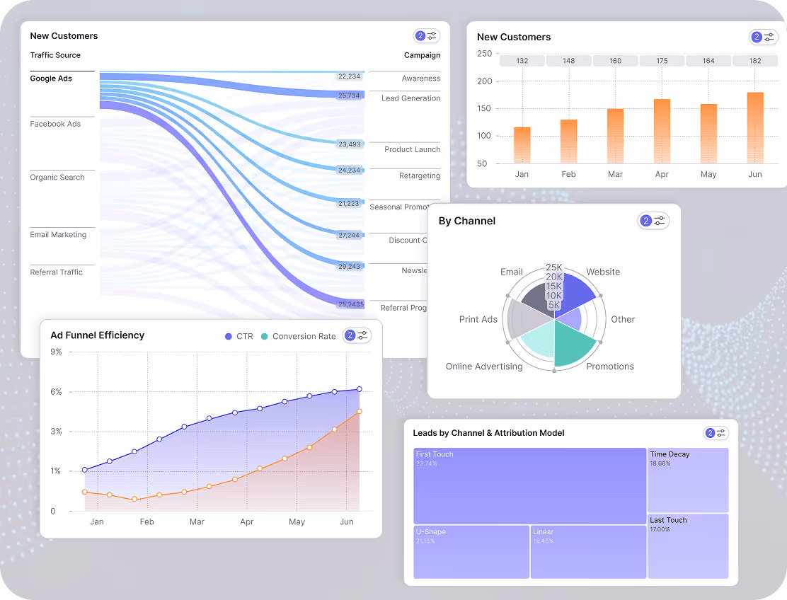
Marketing Campaign Analysis
Measure performance across channels with a clear set of charts that teams can explore. Track impressions, clicks, conversions, CAC, and ROAS, then compare campaigns side by side to see what is working. Filter by platform, audience, creative, or landing page to understand why results changed.
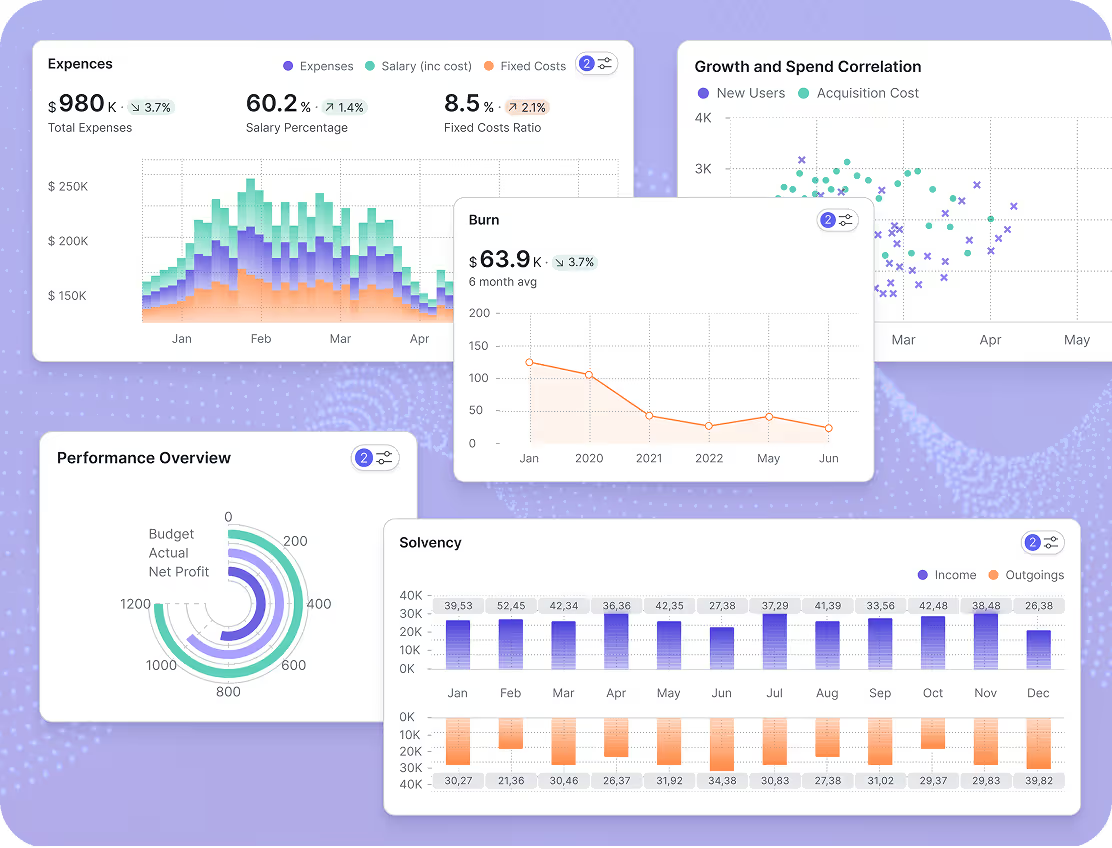
Financial Forecasting and Budgeting
Build finance charts that make trends and variance easy to read. Track revenue, expenses, and cash flow over time, then compare budget vs actual by department, category, or scenario. Use the AI chart generator to create the right view fast, then drill down to the drivers behind changes.
How the AI Chart Generator Works
Create a chart in minutes, then refine it for reporting and exploration. Fusedash helps you move from raw data to a decision ready visual, with interactive filters and drilldowns so you can validate insights and explain what changed.
How the AI Chart Generator Works
Create a chart in minutes, then refine it for reporting and exploration. Fusedash helps you move from raw data to a decision ready visual, with interactive filters and drilldowns so you can validate insights and explain what changed.


Import Your Data
Start from a CSV, spreadsheet export, or API connection. Keep charts aligned as data updates, so your visuals stay current without manual rebuilds.

Choose a Chart Type
Pick the chart you need, or let the AI chart generator recommend the best fit for your data and goal. Use line, bar, area, pie, and more to show trends, comparisons, and breakdowns clearly.

Customize Your Chart
Adjust labels, axes, formatting, and layout so the chart is easy to scan and consistent across reports. Keep the focus on the insight, not the styling.

Enhance with AI Insights
Surface trends, unusual shifts, and outliers automatically. Use AI suggestions to explore possible drivers and confirm what is actually moving the metric.

Make It Interactive
Add filters, drilldowns, and tooltips so viewers can explore details without creating new charts. Interactive charts make analysis faster and reduce back and forth.

Share & Embed
Share charts with a link, reuse them inside dashboards, or export them for reporting. Keep stakeholders aligned on one version of the truth.
Chart Examples for Reporting and Analysis
Explore interactive chart examples built in Fusedash. These views help teams explain results, compare segments, and communicate performance changes clearly, without rebuilding reports every time.
Want to see full dashboards, not just charts? Explore dashboard examples.
Chart Examples for Reporting and Analysis
Explore interactive chart examples built in Fusedash. These views help teams explain results, compare segments, and communicate performance changes clearly, without rebuilding reports every time.
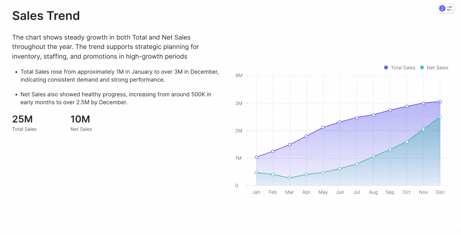
Sales Trend Charts
Track sales over time with interactive trend charts that make direction and seasonality easy to explain. Filter by product, channel, or region, compare periods, and drill in when performance shifts so you can see what changed and where it happened inside an ecommerce dashboard.
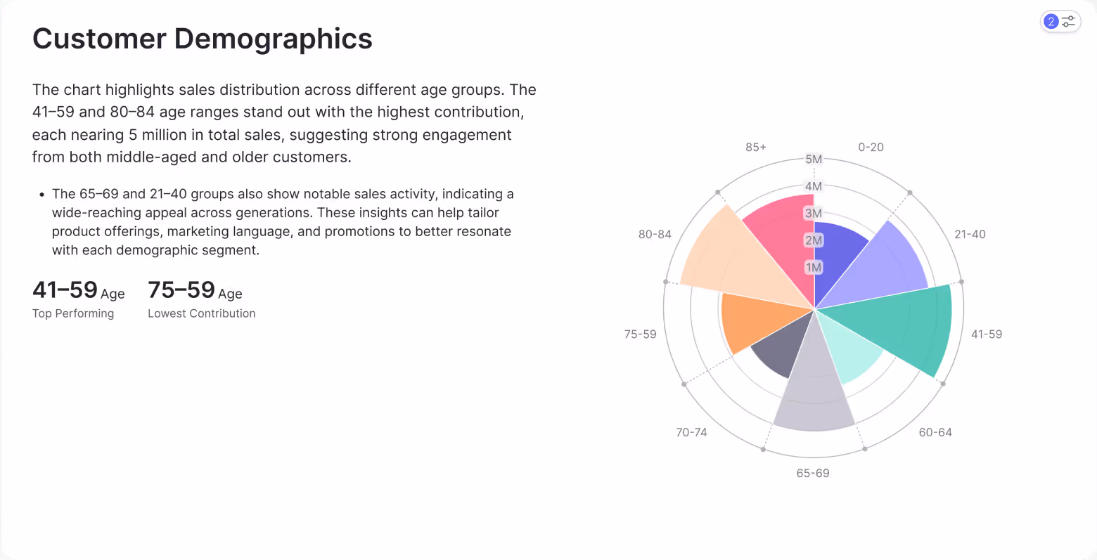
Customer Demographics
Understand who your customers are and how behavior differs across segments. Break results down by age, location, cohort, or plan, then compare conversion and retention to identify your highest value audiences and the segments that need attention for Marketing Teams.
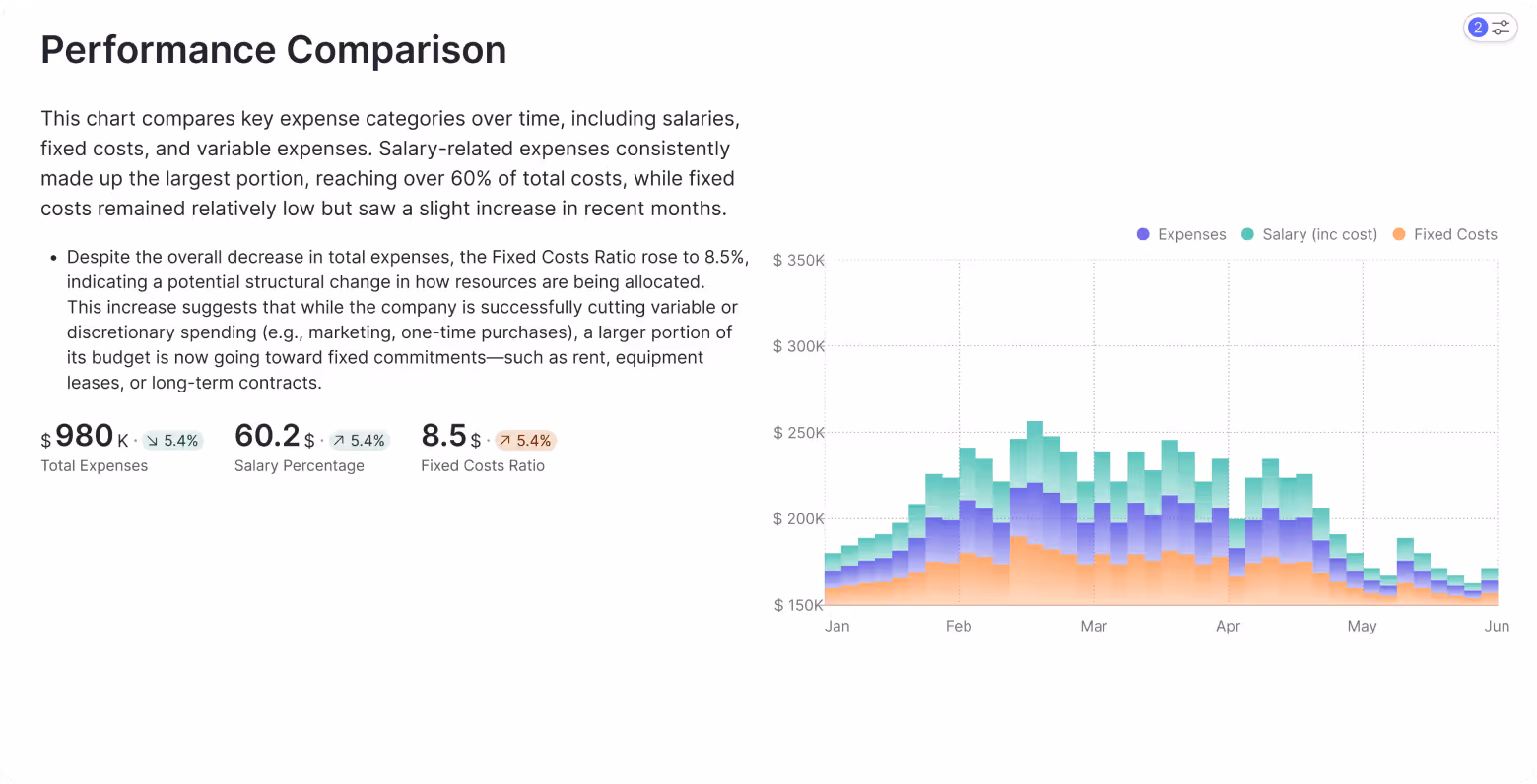
Performance Comparisons
Compare performance across time periods and categories using clear comparison charts. Track how the mix changes month to month, highlight shifts in expense drivers like salary vs fixed costs, and share a simple summary that Finance Teams can review in seconds.
Charts FAQs
Have questions about creating charts with Fusedash? Learn which chart types you can build, how recommendations work, what you can customize, and how to share interactive charts for reporting and analysis.
Charts FAQs
Have questions about creating charts with Fusedash? Learn which chart types you can build, how recommendations work, what you can customize, and how to share interactive charts for reporting and analysis.
What is an AI chart generator?
An AI chart generator is a tool that uses AI to create data visualizations from your dataset without requiring you to configure each element manually. Instead of choosing a chart type, mapping axes, setting aggregations, and formatting labels from scratch, you connect your data and the generator produces a working visual as the starting point. The AI layer adds two things a standard chart builder does not: it recommends the right chart type based on your data structure and goal, and it surfaces patterns, spikes, and outliers you might not have looked for. The result is a chart that is ready to use in reporting or analysis in minutes rather than hours.
What is an AI graph generator?
An AI graph generator is the same category of tool as an AI chart generator: it uses AI to produce data graphs from raw data rather than requiring manual configuration. The terms are used interchangeably in most contexts. The distinction that matters in practice is output type. A graph typically refers to relationship and trend visuals like line graphs, scatter plots, and area charts. A chart covers a broader set including bar charts, pie charts, heatmaps, and tables. An AI graph generator is most useful when the question is about change over time or correlation between variables, where the shape of the data tells the story faster than a number alone.
What chart types can I create with Fusedash?
Fusedash supports line, bar, area, pie, scatter, heatmap, and table views. Line and area charts work best for trends over time. Bar charts work best for comparisons across categories. Scatter charts show correlation between two variables. Heatmaps show intensity across two dimensions such as day of week and hour. Tables work best when exact numbers matter alongside the visual. The AI chart generator recommends the best fit based on your data structure and the type of question you are trying to answer, so you spend less time deciding and more time exploring the result.
Can Fusedash recommend the best chart type for my data?
Yes. The AI chart generator analyses your dataset columns and your goal, then recommends the chart type most likely to make the pattern clear. If your data has a time dimension, it suggests a line or area chart. If you are comparing categories, it suggests a bar chart. If you are looking at distribution, it suggests a scatter or heatmap. You can override the recommendation and switch chart types at any point. The suggestion is a starting point, not a constraint. This removes the most common friction in chart building: staring at a blank canvas and deciding where to begin.
How do I share or reuse charts across dashboards and reports?
Charts built in Fusedash can be shared with a direct link, added to any dashboard as a widget, or embedded in a storytelling report as a supporting visual. Reusing a chart means the same metric definition, aggregation, and formatting carries across every view without rebuilding. When the underlying data updates, every chart that uses it refreshes automatically so stakeholders always see the current numbers. For teams presenting to leadership, the most efficient workflow is to build the chart once, add it to a dashboard for ongoing monitoring, and embed it in a storytelling report for the periodic update.
Can I ask questions about charts in plain language?
Yes. If you prefer asking instead of clicking through filters, use AI Chat to query your charts and get the supporting breakdown.
Turn your data into dashboards
Start a free trial or request a demo to see Fusedash in action.