
Real-Time Dashboard for Live KPI Monitoring and Alerts
Stay ahead with live data intelligence. Build real-time dashboards that update as your data changes. Use Fusedash as a live data interface for monitoring, alerts, and rapid decision-making.
Data changes fast. The Fusedash Real-Time Interface provides live data visualization so teams can monitor KPIs, spot anomalies, and act immediately. Whether you need a real-time analytics dashboard for performance or a live monitoring interface for operations, Fusedash connects directly to your APIs and databases to power auto-updating views without writing code.
What Can Real-Time Interface Do?
Fusedash Real-Time Interface turns live streams into real time data visualization across dashboards, charts, and maps. As values change in your API, database, or event stream, your visuals update automatically so teams can monitor KPIs, catch spikes, and respond without waiting for end-of-day reports.
True Real-Time Sync, No Manual Refresh Needed
Connect live sources and see metrics update as events happen. Your real time analytics dashboard stays current second by second, so you always work from the latest number
Smart Triggers and Alerts
Set thresholds and rules that highlight changes instantly, like sudden drops, unusual spikes, or SLA risks. Get notified and react faster without watching the dashboard all day.
Unified Across Dashboards, Maps, and Charts
Real-time updates apply across your whole workspace, not just one widget. Use the same live data to power charts, maps, and dashboards for a consistent real time monitoring view.
Examples of Fusedash Real-Time Interface in Action
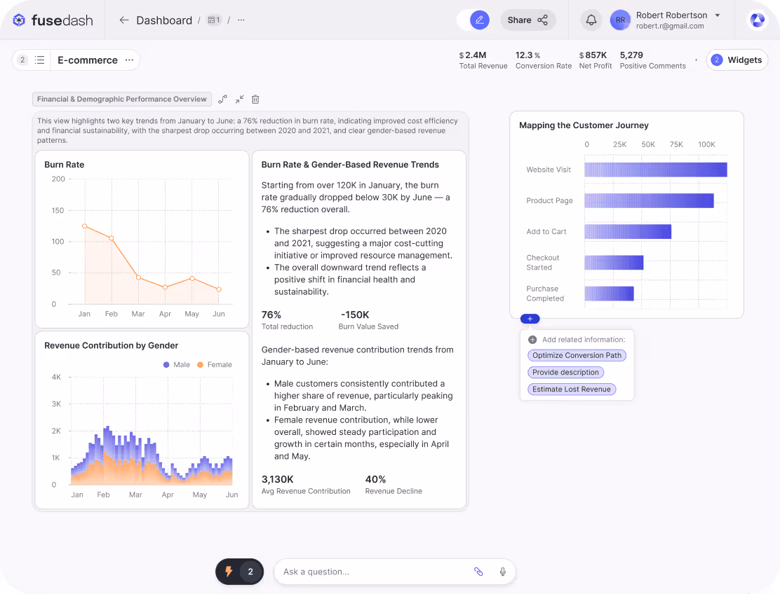
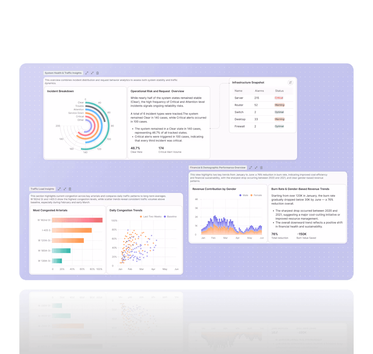
Live Sales Performance Tracker
Track orders, revenue, conversion rate, and cart abandonment as they update. Use a real time dashboard to spot dips or spikes fast, then filter by product, channel, or region to understand what changed and respond with pricing, promotions, or inventory decisions while the moment is still live.
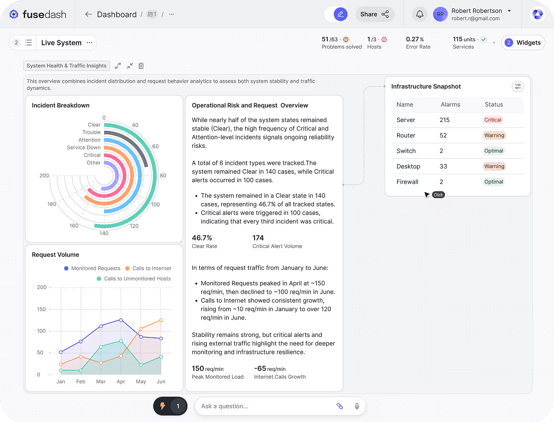
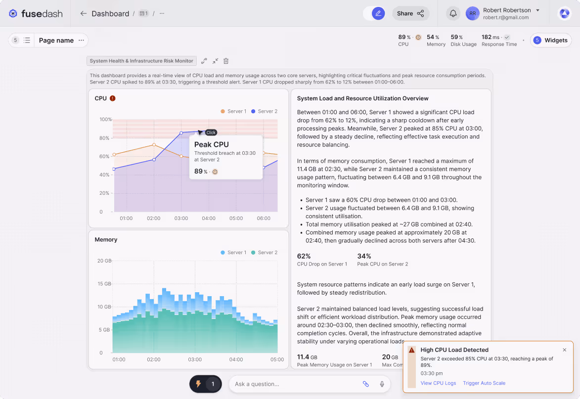
Live System and Infrastructure Health Monitoring
Monitor uptime, latency, error rates, and service health in one real time monitoring dashboard. Set thresholds to surface incidents instantly, so DevOps teams can investigate the source, track impact, and reduce downtime with faster, clearer incident response.
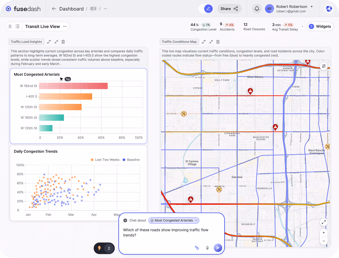
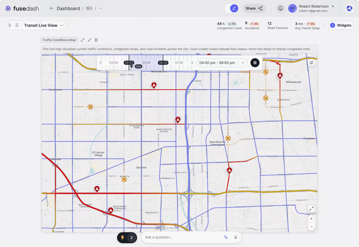
Live Public Data Dashboards (Weather, Transit, Traffic)
Publish real time data visualization for weather, traffic, transit, or city metrics. Pull from live APIs and keep displays updated with location views for websites, operations centers, or shared dashboards, so stakeholders always see the most current information when planning and communicating updates.
How Fusedash Real-Time Interface Works
Fusedash connects live data to a real time dashboard so teams can monitor changes, spot issues, and act immediately. Stream updates from APIs, databases, and event sources into charts, maps, and metrics, then use filters and alerts to track what matters as it happens.


Connect to Live Data Sources
Connect live streams from APIs, databases, cloud tools, or event sources so your dashboard stays in sync with what is happening now.

Set Refresh Rules or Enable Push Updates
Choose interval refresh for stable metrics, or use push updates for instant changes without reloading the dashboard.
Design Your Dashboard Layout
Build a real time analytics dashboard with charts, maps, KPIs, and status panels using a flexible drag and drop layout.

Apply Filters, Thresholds & Triggers
Filter by timeframe, region, product, or team, and define thresholds so the dashboard highlights spikes, drops, and anomalies automatically.

Activate Smart Alerts & Notifications
Send alerts when key metrics cross thresholds. Show notifications in the dashboard, or route them to email and team tools.

Share & Embed Live Dashboards
Share your real time monitoring dashboard with teammates, embed it in internal tools, or display it in a command center.
Examples of Real-Time Dashboard Interactions in Fusedash
Fusedash real-time dashboards update as your data changes, so interactions feel instant. Filter live metrics, drill into spikes, and react to alerts without reloading pages. This makes real time data visualization useful for monitoring, reporting, and rapid decision making across teams. These examples show how teams use real-time dashboards to monitor live KPIs, catch spikes early, and respond while the moment is still recoverable.

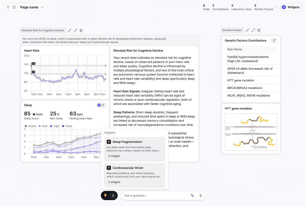
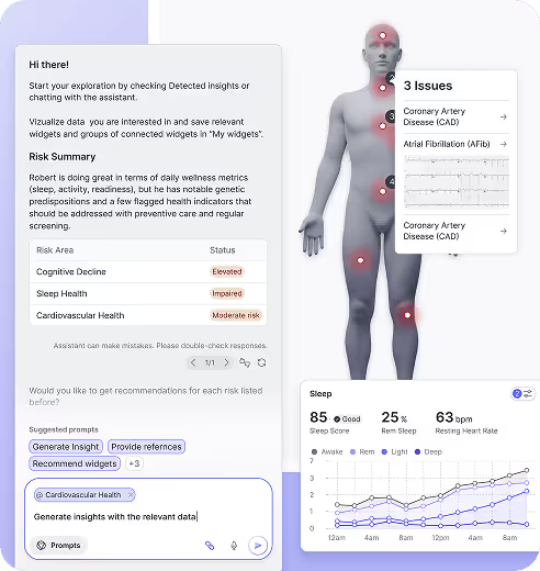
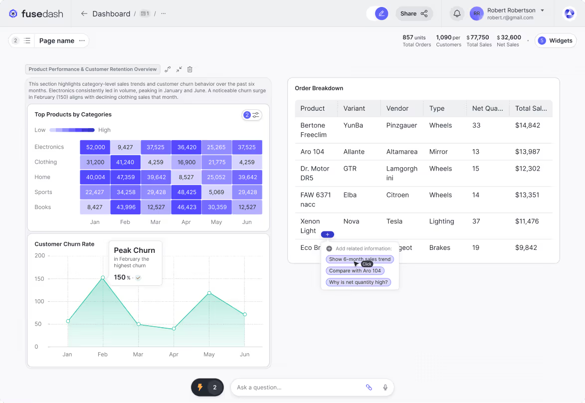
Live Filtering & Drill-Downs
Apply filters by region, product, channel, or timeframe and see the dashboard update instantly. Drill down from an overview to a specific segment to find what is driving changes in performance using AI Chat.
Event-Triggered Visual Changes
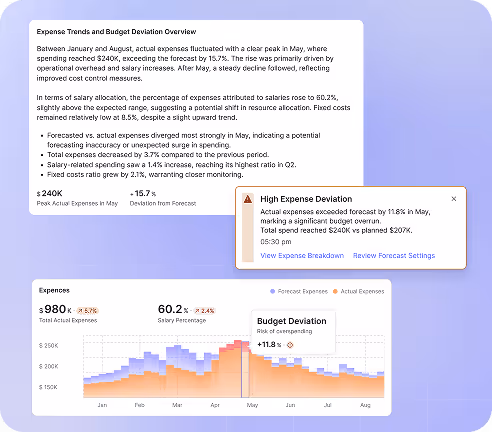
Set thresholds that trigger visual indicators and alerts in real time. When a metric spikes or drops, charts can highlight the issue immediately and notify the right people.
Live Zoom & Timeline Playback
Zoom into map regions or scrub a timeline to inspect changes minute by minute. Replay the last hour, day, or week to spot trends, compare periods, and investigate anomalies faster.
Real-Time Interface FAQs
Have questions about real-time dashboards in Fusedash? Learn how live updates work, which data sources you can connect, how alerts trigger, and what controls you have for refresh and monitoring.
What is a real time KPI dashboard?
A real time KPI dashboard is a live view of the key performance indicators that a team or business tracks on a continuous basis, updated as data changes rather than on a daily or weekly schedule. It is designed for teams whose KPIs move fast enough that waiting for a morning report means missing the window to respond: sales teams monitoring conversion and revenue during a launch, operations teams watching throughput and cycle time during peak periods, or DevOps teams tracking uptime and error rates during a deployment. A real time KPI dashboard typically displays a small number of high-priority metrics prominently, sets thresholds that trigger visual alerts when values cross a limit, and supports drill-downs so the team can move from the KPI to the segment or dimension causing the shift without switching to a different tool.
What is the difference between a real time dashboard and a standard dashboard?
A standard dashboard pulls data on a fixed schedule: once a day, once an hour, or on demand when a user opens the view. The data it shows reflects the last completed refresh, which may be minutes, hours, or a full day behind current events. A real time dashboard pulls from live sources continuously, so the values shown reflect what is happening now. The practical difference is the window for action. A standard dashboard is effective for tracking trends, reviewing performance over time, and preparing for planned reporting. A real time dashboard is effective for monitoring situations where the cost of a delayed response is high: a campaign that is spending against a broken landing page, a system that is approaching downtime, a queue that is backing up faster than capacity can clear it. Most teams need both: a real time dashboard for monitoring and a standard dashboard for analysis and reporting.
When do you need real time dashboard software instead of scheduled reporting?
Real time dashboard software is the right choice when the gap between an event occurring and a team seeing it determines whether they can respond effectively. If a metric can move significantly in the time between scheduled reports and that movement has a cost, waiting for the next export is not a reporting problem, it is a response problem. Common situations where real time dashboard software is necessary include live campaign monitoring where budget is actively spending, infrastructure and system health monitoring where downtime starts the moment an alert is missed, ecommerce launches where conversion rate and checkout errors need to be caught in minutes, and operations monitoring where queue depth or throughput can compound quickly if not addressed. When the data is slow-moving and the decisions are weekly or monthly, scheduled reporting is sufficient. When the data is fast and the decisions need to happen within the same session, real time dashboard software closes the gap between signal and action.
What data sources can connect to a real time data dashboard?
A real time data dashboard connects to sources that can push or stream updated values on a continuous or near-continuous basis. These typically include REST APIs and webhook endpoints that send events as they occur, databases configured for live querying or change-data-capture, cloud platforms and SaaS tools that expose live metrics via API, and event streaming platforms that pass individual transactions or user actions as they happen. The most important factor when connecting a source to a real time data dashboard is defining the metric and dimension that will be monitored before the connection is live: a raw event feed without a clear KPI and breakdown produces noise rather than signal. Starting with a focused set of high-priority metrics from a single source and expanding once the definitions are stable is the approach that produces a real time data dashboard teams actually use rather than one they ignore because it shows too much at once.
Turn your data into dashboards
Start a free trial or request a demo to see Fusedash in action.