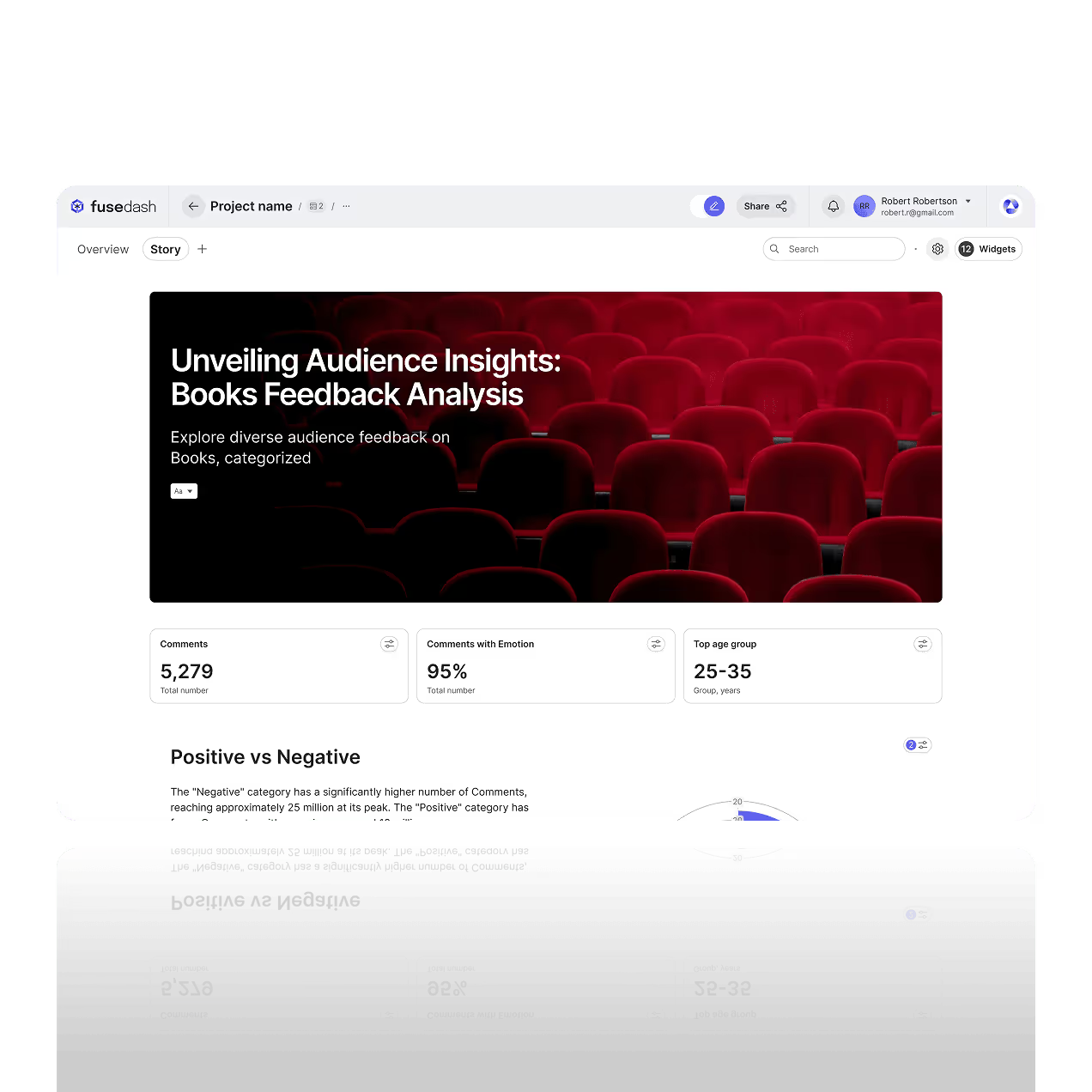

Data Storytelling Software That Turns Your Metrics Into Clear Narratives
Turn raw metrics into a clear narrative with a storytelling chart. Fusedash helps teams create data storytelling that explains what changed, why it changed, and what to do next using charts, highlights, and simple annotations.
Use data visualization storytelling for investor updates, performance reviews, and campaign reporting. Combine interactive visuals with guided takeaways so stakeholders understand the meaning behind the numbers, not just the charts.
What is a Storytelling Chart Feature?
Fusedash helps you turn charts into a story, not just a report. Build a storytelling chart that highlights what changed, adds context, and guides the reader through the key takeaways with clear structure and annotations.
Use data visualization storytelling when you need stakeholders to understand the meaning behind the numbers. Create a narrative from your data, support it with charts and comparisons, and share a story that is easy to follow and easy to act on. It sits on top of your business intelligence metrics, so every update stays data driven and consistent across teams.
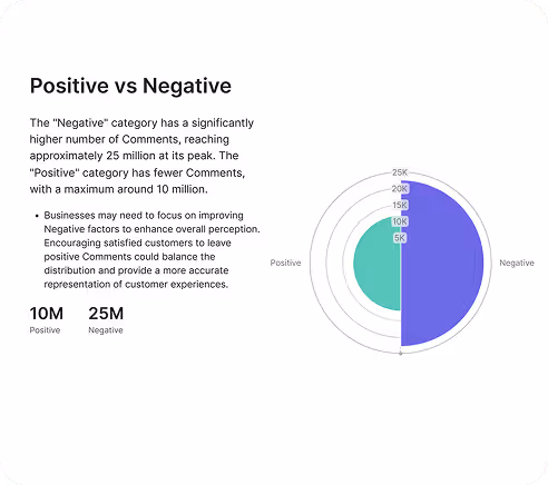
Engage your Audience with Storytelling Charts
A storytelling chart focuses attention on one clear point. Use highlights, comparisons, and annotated callouts so readers understand the insight quickly, even when the data is complex.
Simplify Communication for Stakeholders
Turn raw metrics into a narrative that explains the takeaway. Compare trends, summarize what changed, and present the evidence with clean visuals that make decisions easier.
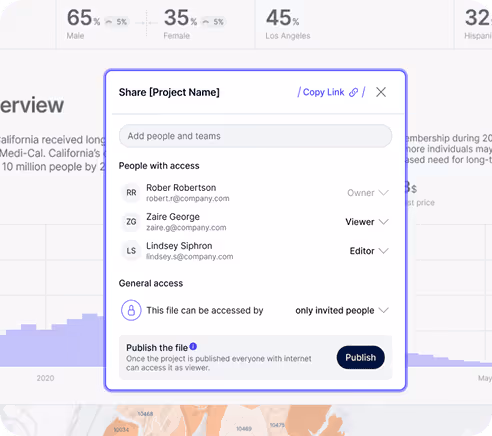
Collaborate on the Story, not Screenshots
Share a single source of truth, leave comments, and iterate on the narrative with your team. Stakeholders can review the same charts and context without chasing versions across docs and slides.
Create a Narrative with Storytelling Charts
This turns results into powerful data visuals with clear context, drivers, and next steps. Use your business intelligence KPIs and real time data to publish data driven updates and export interactive presentations for stakeholders.

Investor presentations and updates
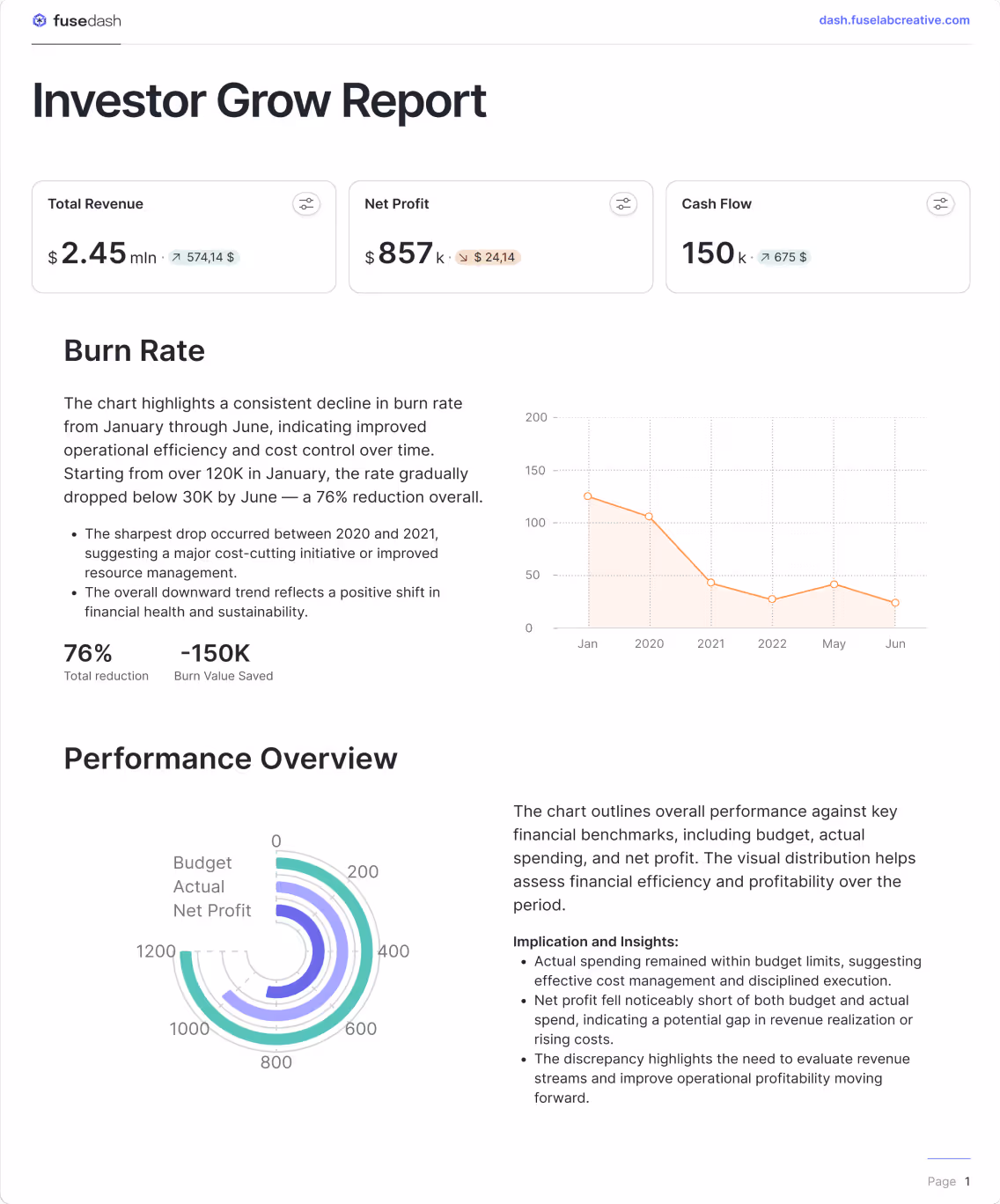
Create a clear investor story with storytelling charts that explain performance, not just results. Highlight revenue growth, burn, retention, and projections, then annotate the drivers behind changes so stakeholders understand what happened and why.
Marketing campaign reports
Turn campaign results into a narrative that is easy to act on. Use data storytelling to summarize ROI, conversions, CAC, and trend shifts, then compare channels and time periods with storytelling charts and clear takeaways inside your Marketing Dashboard.
Educational content and explainers
Make complex topics easy to understand with data visualization storytelling. Combine a storytelling chart with step by step narrative flow to explain trends, comparisons, and cause and effect. This works for internal training, customer education, research summaries, and product walkthroughs.
How to create a storytelling chart in Fusedash
Build data storytelling in minutes using storytelling charts and a guided narrative flow. Add visuals, highlight what changed, annotate key insights, and share a story that stakeholders can understand without extra meetings.


Choose a Template
Start with a storytelling template designed for clear takeaways. Pick a layout that matches your audience, then organize sections so the story is easy to scan.
Add Data Visuals
Add charts that support your message, then use a storytelling chart to emphasize the main point. Include comparisons, time ranges, or segments so the insight is backed by evidence.

Create a Narrative Flow
Arrange visuals in a sequence that answers one question at a time. Move from context to insight to conclusion so the reader understands what changed and why it matters.
Enhance with Annotations
Add annotations, highlights, and callouts to explain the takeaway. This turns data visualization storytelling into a narrative that people can act on quickly.
Embed Media
Add supporting context like images, docs, or links. Use media only when it helps explain assumptions, definitions, or methodology behind the numbers.
Publish and Share
Share a link with stakeholders or export for presentations. Collect feedback in one place so teams align faster and decisions happen with less back and forth.
Financial outlook report
Create a finance story with a storytelling chart that explains cash flow, profit, burn rate, and forecast variance. Compare scenarios, highlight the drivers behind changes, and share a clear narrative stakeholders can understand without digging through spreadsheets.

Investor growth story
Build an investor-ready growth narrative that connects revenue growth, retention, CAC payback, and runway in one flow. Highlight what changed, compare periods, and summarize the drivers behind performance so stakeholders understand the story fast.
See also: Finance dashboard reporting
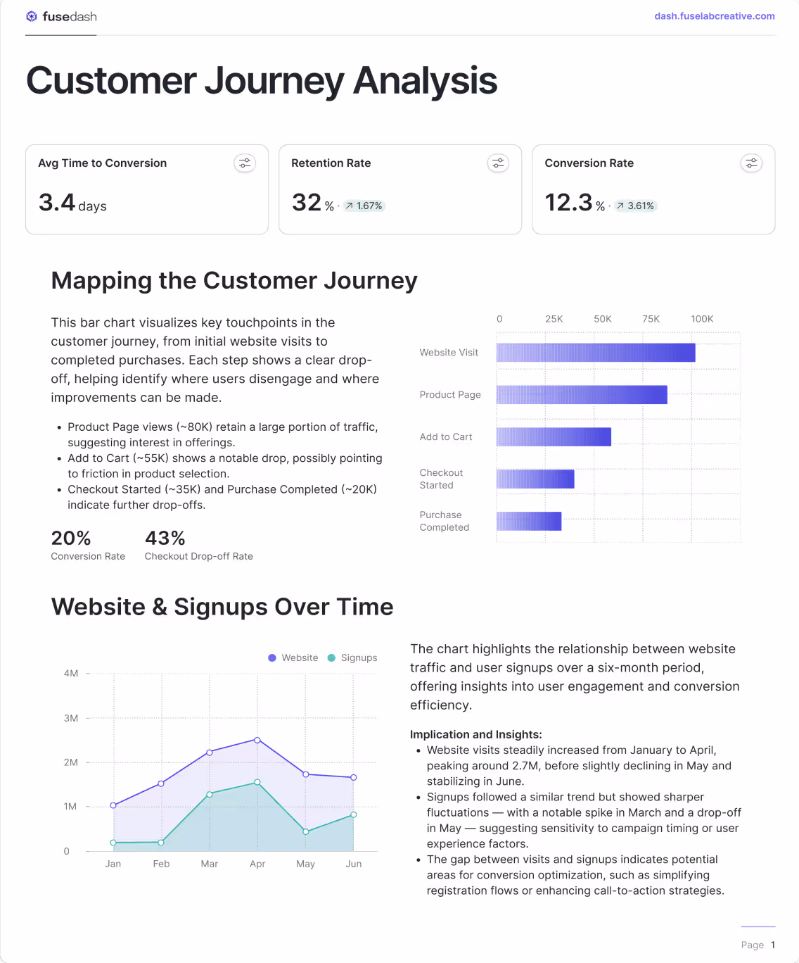
Customer journey story
Turn customer data into data visualization storytelling that shows acquisition, conversion, and retention in one view. Use storytelling charts to highlight drop-offs, compare cohorts, and explain what changed across time periods or segments.
See also: AI chart generator for cohort comparisons.
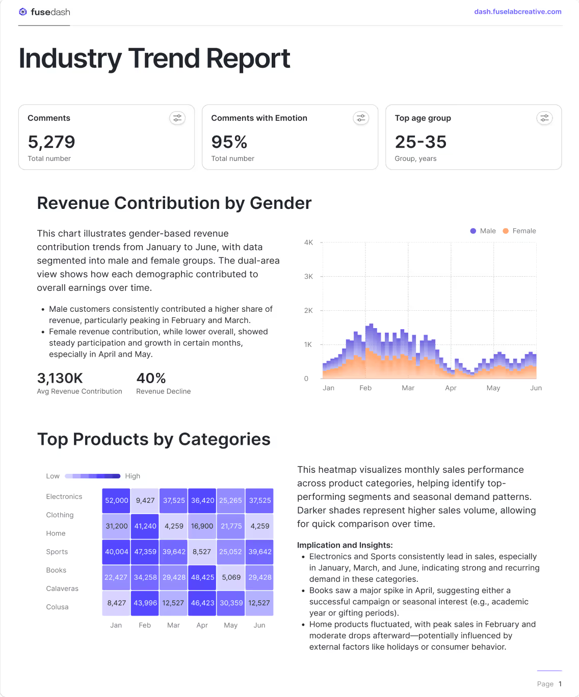
Industry trend story
See dashboards for ongoing monitoring.
Data storytelling FAQs
Quick answers on data storytelling, storytelling charts, and sharing updates with stakeholders. Stories can refresh on schedule or use real time data when minutes matter.
What is data storytelling?
Data storytelling is the practice of combining data, visuals, and narrative to explain what happened, why it happened, and what to do next. Where a dashboard shows the current state of your metrics, data storytelling builds a sequence: context first, then the key change, then the cause, then the implication. The goal is not to display data but to make it understood. A data story is successful when a stakeholder can read it once and know what decision to make, without asking follow-up questions or requesting a separate analysis.
What is a storytelling chart?
A storytelling chart is a data visual designed to communicate one clear insight rather than display all available data. It uses comparisons, highlights, and annotations to draw the reader's attention to the most important point in the data. Unlike a standard chart that presents information neutrally, a storytelling chart has a point of view: it shows what changed, frames it against a reference period or target, and guides the reader toward the takeaway. The annotation layer is what separates a storytelling chart from a reporting chart. Without annotation and context, a chart shows data. With it, a chart tells a story.
What is data visualization storytelling?
Data visualization storytelling is the combination of visual data presentation and narrative structure to guide an audience from raw numbers to a clear conclusion. It goes one step further than data visualization alone. A visualization makes data readable. Data visualization storytelling makes data actionable by adding the sequence, context, and explanation that tells the audience what the visual means and what they should do with it. The most effective data visualization storytelling follows a three-part structure: establish the context, show the change or finding, and explain the implication. Each visual in the story supports one step in that sequence rather than presenting all information at once.
What is a chart story?
A chart story is a structured narrative built around one or more data visuals, where the charts and the written context work together to answer a single question for the reader. The chart provides the evidence. The story provides the meaning. A chart story differs from a slide deck or a report in that every element, the title, the visual, the annotation, and the takeaway, is arranged to move the reader from question to answer in a single flow. Chart stories are particularly effective for investor updates, campaign post-mortems, and performance reviews where the audience needs to understand what happened quickly and leave with a clear next step.
What is the difference between data storytelling and a dashboard?
A dashboard is a live view of metrics designed for ongoing monitoring. It answers the question: what is happening right now? A data story is a structured narrative designed for a specific audience at a specific moment. It answers the question: what happened, why did it happen, and what should we do about it? The practical difference is cadence and intent. Dashboards are built to be reviewed repeatedly, often daily or weekly, by teams who already know the context. Data stories are built to be read once by stakeholders who need the context explained before they can act. The most effective analytics workflows use both from the same dataset: dashboards for the team running the process, data storytelling for the stakeholders who need to understand the outcome.
When should I use data storytelling instead of a dashboard?
Use data storytelling when your audience needs context to understand the numbers, not just access to them. If you are presenting results to someone who does not monitor the metrics daily, a dashboard will not give them enough framing to act. A data story provides the setup, the finding, and the implication in one flow. Specific situations where data storytelling is more effective than a dashboard: investor and board updates where the audience needs narrative alongside performance data, post-campaign reports where the goal is to explain ROI and recommend next steps, quarterly business reviews where leadership needs to understand drivers not just outcomes, and any situation where the recipient will read the analysis once and make a decision rather than explore the data themselves.
What should a data storytelling report include?
A data storytelling report should include four elements in sequence. First, context: the period, the goal, and what was expected. Second, the key finding: the single most important thing that changed or was discovered, supported by a storytelling chart that makes it visually clear. Third, the drivers: what caused the finding, broken down by the segments or factors that explain the change. Fourth, the implication: what the finding means for the next decision, expressed as a clear recommendation or next step. Reports that include all four elements in this sequence give stakeholders everything they need to act without a follow-up meeting. Reports that skip context or implication leave the audience with data but no direction.
Turn your data into dashboards
Start a free trial or request a demo to see Fusedash in action.