SaaS Dashboard

Turn MRR, churn, cohorts, and product usage into one SaaS metrics dashboard.

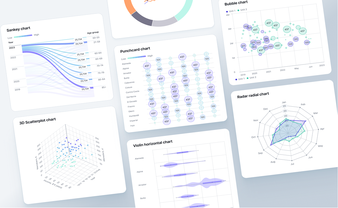
In SaaS, the numbers don’t fail all at once. Retention softens in a segment, activation slows after an onboarding tweak, expansion stalls for one plan, and the impact shows up later in MRR. Fusedash helps you build a SaaS dashboard that connects revenue movement to product behavior so teams can see the driver behind change, not just the outcome.

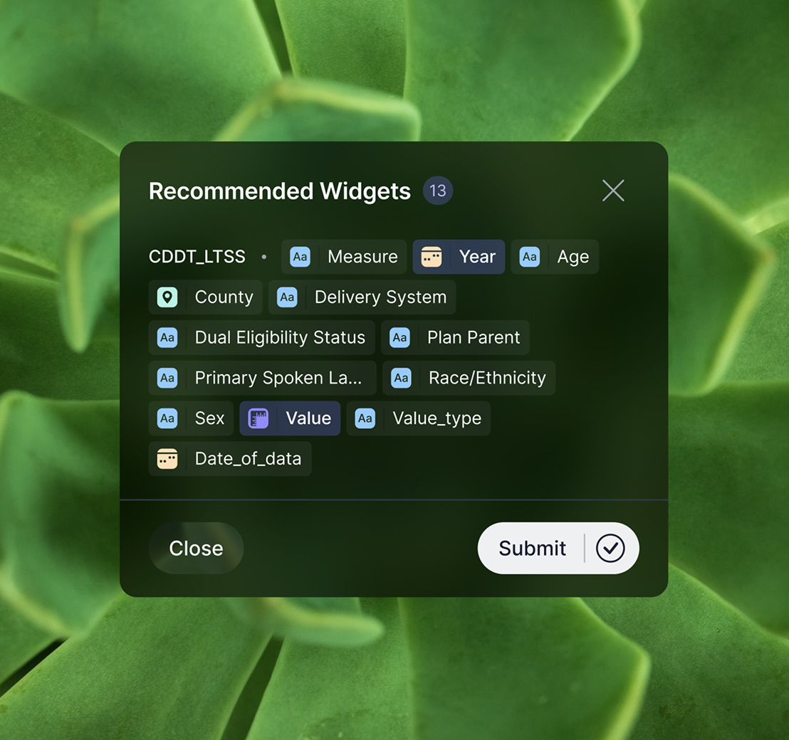
Use it as an MRR dashboard for leadership, a churn dashboard for retention and contraction analysis, and a product metrics dashboard to track activation, engagement, and feature adoption by plan, cohort, and segment. Start with dashboard software. For clearer comparisons, use charts. For incident-driven shifts, add real-time monitoring

fusedash/ag.drone
Daily signals

What your SaaS dashboard should explain every week

A SaaS metrics dashboard should not be a scoreboard. It should speed up diagnosis: what moved, which segment caused it, and what teams should test or fix next.

Daily signals

What your SaaS dashboard should explain every week

A SaaS metrics dashboard should not be a scoreboard. It should speed up diagnosis: what moved, which segment caused it, and what teams should test or fix next.

Is MRR growth coming from new sales, expansion, or pricing changes?
Did churn rise as logo churn, revenue churn, or downgrade contraction?
Which plan, segment, or acquisition channel shifted compared to last period?
Are new cohorts retaining better than last month’s cohorts?
Did activation or time-to-value slow down for a specific use case?
What should we do next: improve activation, address risk, or optimize expansion?
Dashboard views

The SaaS dashboard views teams actually use

Different teams ask different questions. These views cover leadership reporting, churn diagnosis, product adoption, and cohort health without forcing one “mega dashboard”

Dashboard views

The SaaS dashboard views teams actually use

Different teams ask different questions. These views cover leadership reporting, churn diagnosis, product adoption, and cohort health without forcing one “mega dashboard”

Insights-Driven Platform
Revenue Movement

MRR dashboard (growth drivers)

Track MRR and ARR with a clean breakdown of new, expansion, contraction, and churn, plus comparisons that show whether momentum is improving or fading.

Retention Health

Churn dashboard (NRR and GRR trends)

Separate churn types and show NRR/GRR direction by plan and segment so you can see where churn concentrates before it spreads.

Activation and Adoption

Product metrics dashboard (time-to-value)

Monitor activation, time-to-value, and adoption of retention-driving features. Segment by plan, persona, and channel to find where users get stuck.

Cohort Analysis

Retention dashboard (cohorts and long-term behavior)

Compare cohorts before and after onboarding or product changes to see whether improvements stick over time.

Getting Started

How to build your SaaS dashboard in Fusedash

Build your first dashboard for one job: explain a change quickly. Once it becomes part of your weekly rhythm, expand into deeper cohort and product views.

Getting Started

How to build your SaaS dashboard in Fusedash

Build your first dashboard for one job: explain a change quickly. Once it becomes part of your weekly rhythm, expand into deeper cohort and product views.

Insights-Driven Platform
01

Connect subscription and product usage data

Bring together subscription metrics (MRR movements, renewals, plan changes) and product signals (activation events, key actions, feature usage). Import CSVs or connect APIs and databases.

02

Choose the first view your team will actually use

Start with one: MRR movements, churn drivers, or activation. A single useful view beats a wide dashboard nobody opens.

03

Add breakdowns that reveal the driver

Break down by plan, segment, cohort, and acquisition channel. Use time comparisons to pinpoint when the shift started and what changed.

04

Add drill-down filters for fast root cause analysis

Add filters for plan, segment, cohort, channel, lifecycle stage, and date range. Drill down from churn or MRR movement into the exact segment responsible without rebuilding reports.

Fusedash Builder

Build dashboards teams trust: consistent definitions, fast drill-downs, and shareable views for leadership and operators.

Start a free trial

SaaS KPIs to track first

A SaaS dashboard becomes useful when it explains revenue movement and retention, not just totals. Start with these KPIs, then break them down by plan, segment, and cohort to find the real driver behind change.

MRR movement: new, expansion, contraction, churn
Retention: NRR/GRR direction and cohort retention trends
Churn: logo churn vs revenue churn, plus plan-level concentration
Product usage: activation rate and adoption of key features
Need clearer comparisons? Explore charts.

Churn diagnosis that points to the cause

“Churn increased” is not an insight. A churn dashboard should show where churn concentrates, what changed first, and which behavior patterns preceded the churn.

Separate logo churn, revenue churn, and contraction
Identify churn concentration by plan, segment, and cohort
Compare periods to isolate when the shift started
Tie churn movement to activation and key event usage

Cohorts that show whether changes worked

Cohorts tell you whether onboarding tweaks and product releases improved real retention. Compare cohorts pre-change vs post-change to see long-term impact without guessing.

Retention curves by cohort, plan, and segment
Expansion and contraction behavior across cohorts
Adoption signals that correlate with stronger retention
Filters to isolate the segment that changed

Smart insights for SaaS teams

When metrics move, time gets wasted in back-and-forth analysis. Use smart exploration to generate the next breakdown and get from “something changed” to “here’s why” faster.

Recommended breakdowns for MRR, churn, and retention by segment
Suggested views for activation, time-to-value, and feature adoption
Period comparisons to highlight what changed and where it started
Save reusable views for weekly reviews and board reporting
FAQs Section

SaaS dashboard FAQs

Common questions teams ask when building a SaaS dashboard for MRR, churn, retention cohorts, and product usage.

FAQs Section

SaaS dashboard FAQs

Common questions teams ask when building a SaaS dashboard for MRR, churn, retention cohorts, and product usage.

What is a SaaS dashboard?

A SaaS dashboard is a centralized view of revenue, retention, and product usage metrics. It helps teams understand what is driving MRR movement, diagnose churn, and track cohorts and adoption with consistent definitions.

What should a SaaS metrics dashboard include first?

Start with MRR movements, NRR/GRR direction, logo and revenue churn, activation rate, and a small set of key product usage signals. Then add breakdowns by plan, cohort, and segment.

How do I build a churn dashboard that helps me act?

Separate churn types, compare time periods, and isolate churn concentration by plan, segment, and cohort. Then connect churn movement to activation and usage so the team can fix the driver.

What is a retention dashboard vs a cohort dashboard?

A retention dashboard summarizes retention metrics and trends. A cohort dashboard shows retention curves by signup period or segment, making it easier to evaluate onboarding and product changes.

Can a SaaS dashboard update in real time?

Yes. Real-time views are useful when activation, key events, or trial conversion can shift quickly after releases, campaigns, or incidents.

Can I share this dashboard with stakeholders?

Yes. Shared dashboards keep product, growth, and revenue teams aligned on the same KPI definitions and reduce conflicting reports.

Ready to build a decision-ready SaaS dashboard?

Track MRR, churn, NRR/GRR, retention cohorts, and product usage in one place. Drill down by plan and segment, find the driver behind change, and share a clear view your team can trust.