Interactive Map Visualization for Location Analytics and Regional Data
Turn location data into interactive maps that make regional patterns obvious. Track coverage, performance, and distribution, then filter, zoom, and drill into areas to see what changed and why.
Build choropleth, point, and heatmap visualizations, then add charts or tables beside the map for context. Start from a CSV or connect an API, customize layers, labels, and tooltips, and embed maps inside dashboards and reports so everyone sees the same view.
What is the Maps Feature?
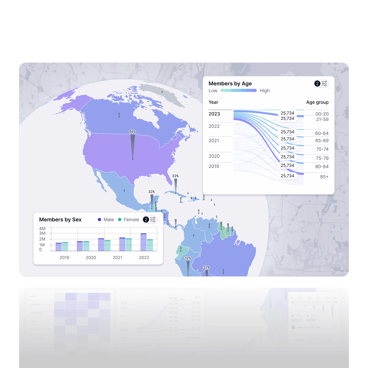
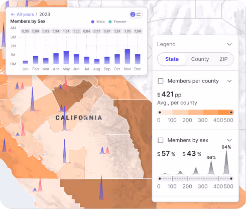
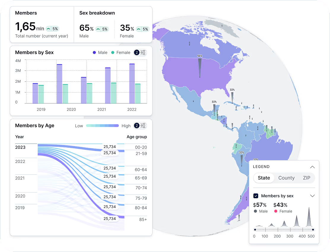
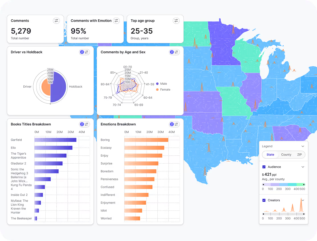
Fusedash Maps turns geospatial data visualization into clear, interactive map visualizations you can explore in seconds. Pick the right map chart for your question, from choropleth maps and heatmaps to point maps and cartograms, then filter and drill into regions to understand performance by location. Use maps to track regional sales, customer distribution, coverage, and territory performance, all in one workspace.
Visualize Geographic Data
Make location data easy to read at a glance. Spot hotspots, gaps, and regional patterns, then group results by territory, market, or custom regions so teams can compare performance across locations in a dashboard.
Real Time Map Updates
Keep maps current as your data changes. Connect CSVs or APIs and refresh views automatically so your location analytics dashboard stays accurate for real-time monitoring and weekly reviews.
Interactive Map Exploration
Explore performance by country, region, city, or territory. Zoom in, filter by segment, and drill into details to compare locations side by side, or ask questions about your data by region.
Ways teams use maps in Fusedash
Use map charts to compare performance by location, spot geographic patterns, and drill into regions without rebuilding reports.
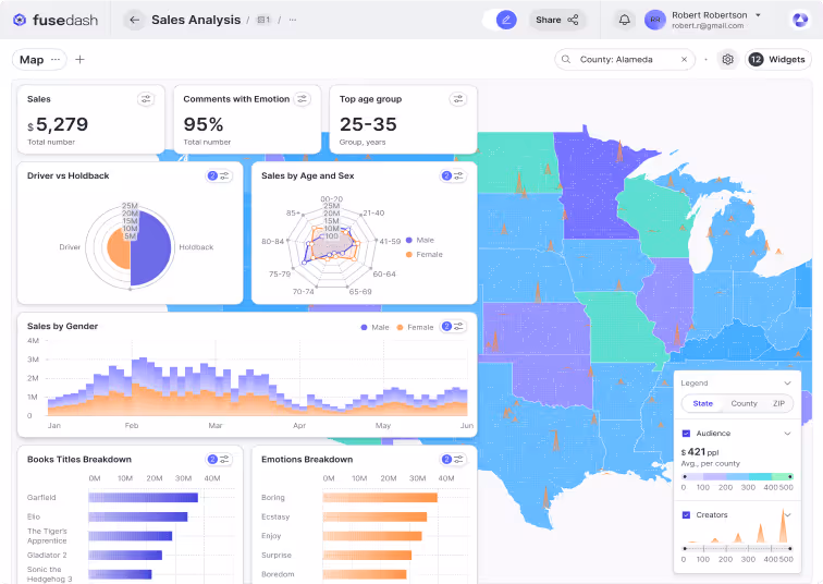
Regional Sales Analysis
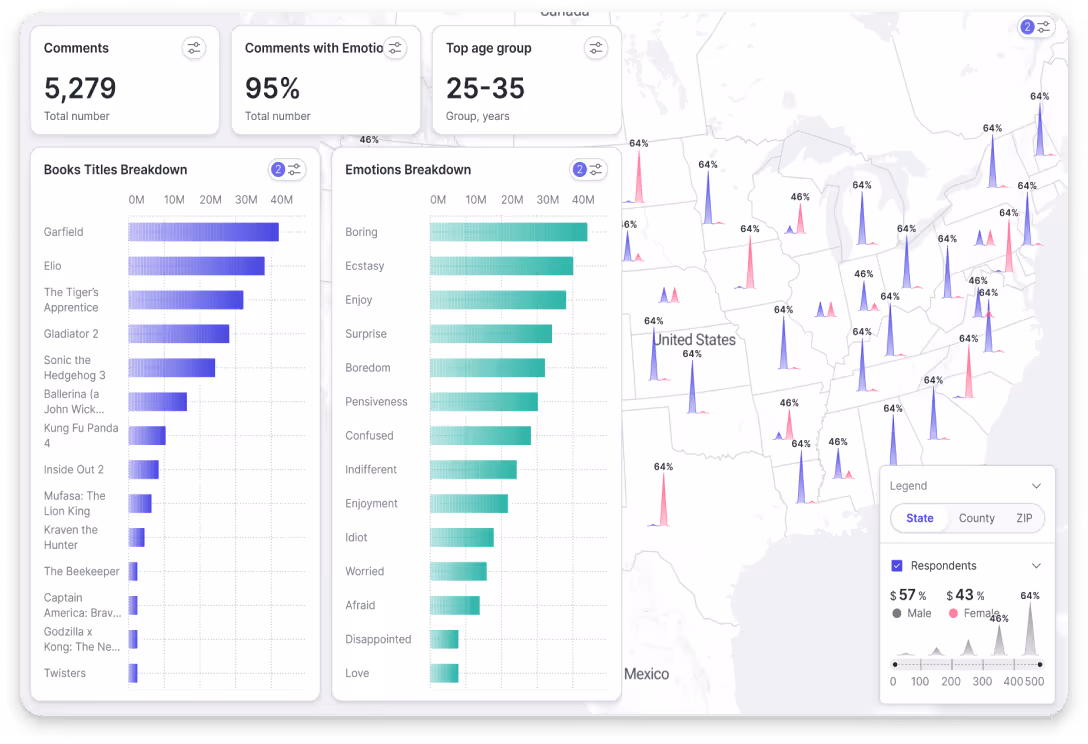
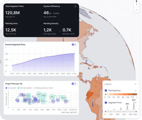
See performance by country, state, city, or territory. Use a choropleth map to compare revenue, orders, or conversion rate by region, then filter by product line, channel, or time period to find your strongest markets and the areas that need attention for ecommerce dashboards.
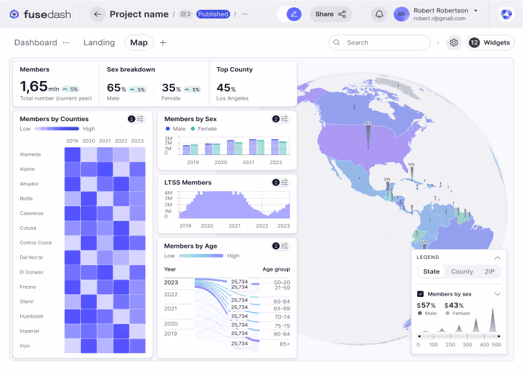
Customer Demographics by Location
Understand who your customers are and where they are concentrated. Map segments by location and compare age groups, cohorts, or behavior by region so you can tailor messaging, prioritize markets, and plan expansion using real geographic patterns.
Supply Chain and Logistics Tracking
Track coverage, service areas, and regional performance in one view. Layer operational metrics on a map, filter by region or team, and drill into locations to spot gaps, delays, or bottlenecks, and coordinate faster decisions with an operations and logistics dashboard.
How Fusedash Maps Work
Fusedash turns location-based data into interactive map visualizations you can explore and share. Connect a dataset, choose the right map type, then configure layers and styling to reveal regional patterns. Use filters and drill-downs to answer questions faster, and embed the map into a dashboard or share a live view with your team.


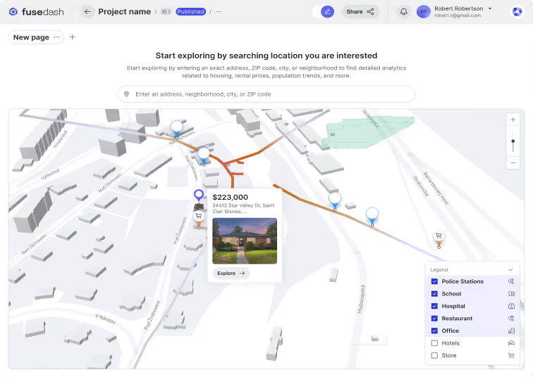
Upload or Connect Data
Import location-based data from CSVs, spreadsheets, databases, or APIs to start building a map view.

Choose a Map Type
Select the best map chart for the question, including choropleth maps, heatmaps, point maps, and cartograms.

Customize Visual Elements
Adjust layers, legends, tooltips, and thresholds so the map highlights what matters and stays easy to read.

Leverage AI-Powered Insights
Get suggestions for views, segments, and outliers so you can spot patterns and investigate faster.

Make Maps Interactive
Enable zoom, filters, and drill-downs so viewers can explore regions, compare segments, and inspect specific locations.

Share & Embed with Ease
Share a live map view with a link or embed it inside dashboards so teams stay aligned in one workspace.
Examples of Maps Built Using Fusedash
Explore real data visualization map examples built in Fusedash. From regional sales coverage to customer density and route monitoring, these geospatial data visualization views help teams spot patterns by location, drill into regions, and share results inside dashboards. Build a choropleth map, a heatmap map visualization, or a route map from your own data, then filter by segment and timeframe to find what is driving changes
Choropleth Map
A choropleth map colors regions by value so you can compare performance at a glance. Use it to map revenue, orders, conversion rate, or customer distribution by country, state, or territory, then filter by time period, channel, or product line to spot high and low performing regions quickly inside an ecommerce dashboard.
Customer Density Heatmap
Heatmaps show concentration and hotspots using color intensity, making clusters easy to see. Map customer density, store activity, service requests, or deliveries to understand where demand is highest, where coverage is thin, and which areas are changing over time as you zoom and filter for Marketing Teams.
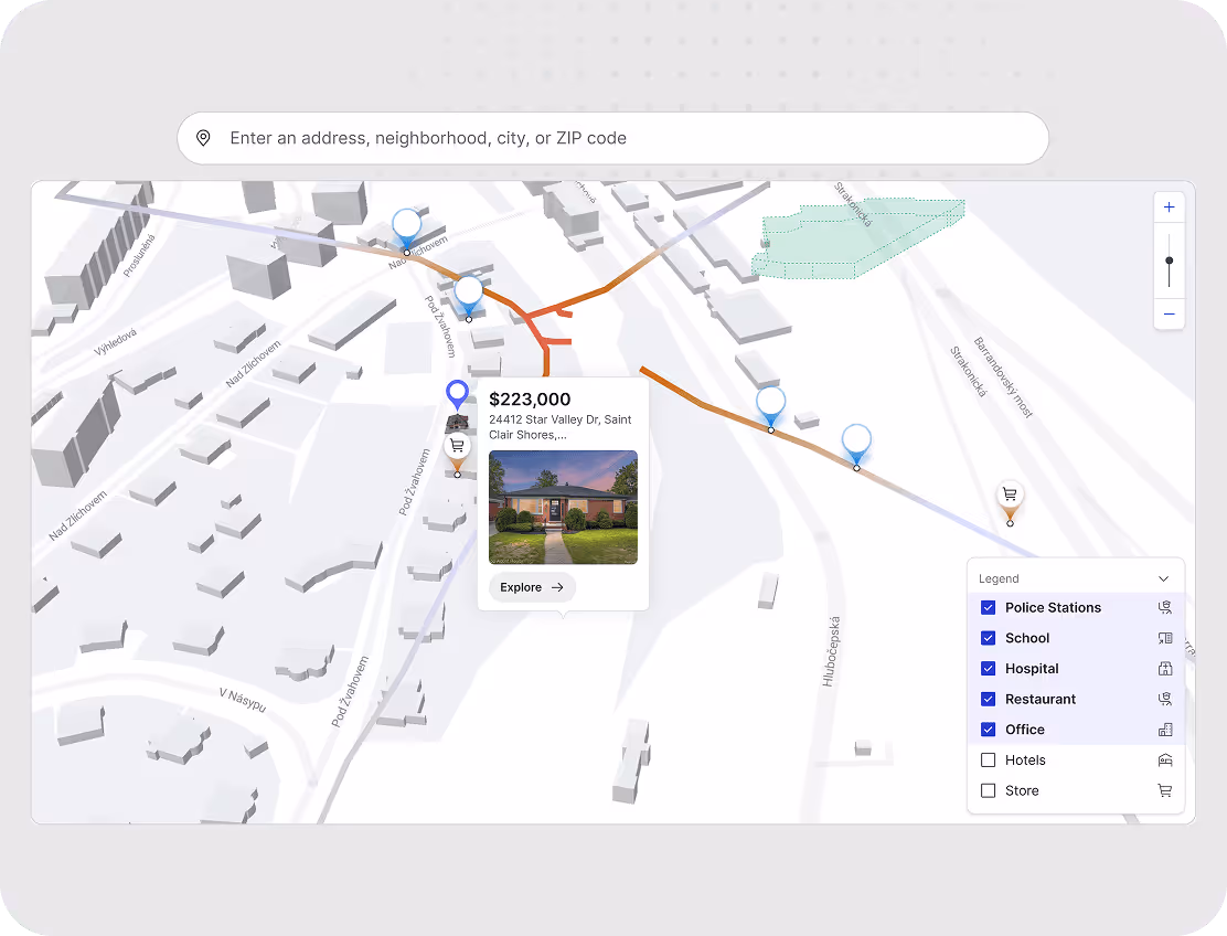
Supply Chain Route Map
Route maps visualize hubs, stops, and delivery paths so you can understand how work moves across locations. Track routes, shipments, or field operations with markers and layers, then filter by region, status, or timeframe to diagnose delays, compare routes, and improve on-time performance with an operations and logistics dashboard.
Map Visualization FAQs
Have questions about map visualization in Fusedash? Learn how to upload location data, choose map types, use filters and layers, and share interactive maps with your team.
What is a data visualization map?
A data visualization map is a geographic view that represents data values across locations using color, size, or density so patterns that are invisible in a table become obvious at a glance. Instead of reading rows of numbers by region, a data visualization map shows which territories are performing above or below average, where demand is concentrated, and where gaps exist, all in one view. The most useful data visualization maps are interactive: they let teams filter by time period, segment, or product line and drill into specific regions to understand what is driving the pattern rather than just observing that one exists.
What is geospatial data visualization?
Geospatial data visualization is the practice of representing data that has a location component on a map or geographic canvas so the spatial relationship between data points becomes part of the analysis. Where a standard chart shows what happened and when, geospatial data visualization adds where. This matters when location is a variable that explains performance: why one region converts better than another, where demand is growing, which territories are underserved, or how distribution coverage maps against customer density. The most effective geospatial data visualization combines location data with business metrics like revenue, orders, or service requests so teams can make geographic decisions from the same dataset they use for all other reporting.
What is a choropleth map?
A choropleth map is a type of data visualization map that uses color shading to represent a single value across defined geographic regions such as countries, states, or territories. Darker or more saturated colors typically indicate higher values, lighter colors indicate lower values. Choropleth maps are best suited for comparing a rate or ratio across regions: revenue per territory, conversion rate by state, or churn rate by country. They work less well for raw totals because larger regions naturally accumulate more volume regardless of actual performance. The most useful choropleth maps use a normalized metric, show a clear legend, and allow filtering by time period so the comparison stays fair across regions of different sizes.
How do I choose the right map type for my data?
The right map type depends on the question you are trying to answer and the structure of your location data. Use a choropleth map when you have one value per defined region and want to compare performance across territories: revenue by country, conversion rate by state, or churn by region. Use a heatmap when you want to show density and concentration without predefined boundaries: customer clustering, delivery volume, or store visit frequency. Use a point map when you need to plot exact locations: stores, accounts, service sites, or events. Use a route map when the relationship between locations matters: delivery paths, field team coverage, or logistics networks. The most common mistake is choosing a map type before defining the question. Start with what decision the map needs to support, then select the type that makes the answer visually obvious.
What are common mistakes to avoid with choropleth maps?
The most common mistake is mapping raw totals instead of rates. A country with a large population or territory will always show a higher total than a smaller one, even if its performance per customer or per order is weaker. Use rates, ratios, or per-unit metrics so the comparison is fair across regions of different sizes. The second mistake is using too many color steps. More than five or six shades makes the legend hard to read and the pattern unclear. The third is choosing color scales that are hard to distinguish for people with color vision differences: avoid red-green scales and use sequential or diverging palettes instead. The fourth is leaving out context. A choropleth map showing revenue by region tells the reader nothing about whether those numbers are good or bad without a comparison period, a target, or a benchmark. Add a time period selector or a target line so the map answers not just where but whether performance is improving.
Turn your data into dashboards
Start a free trial or request a demo to see Fusedash in action.