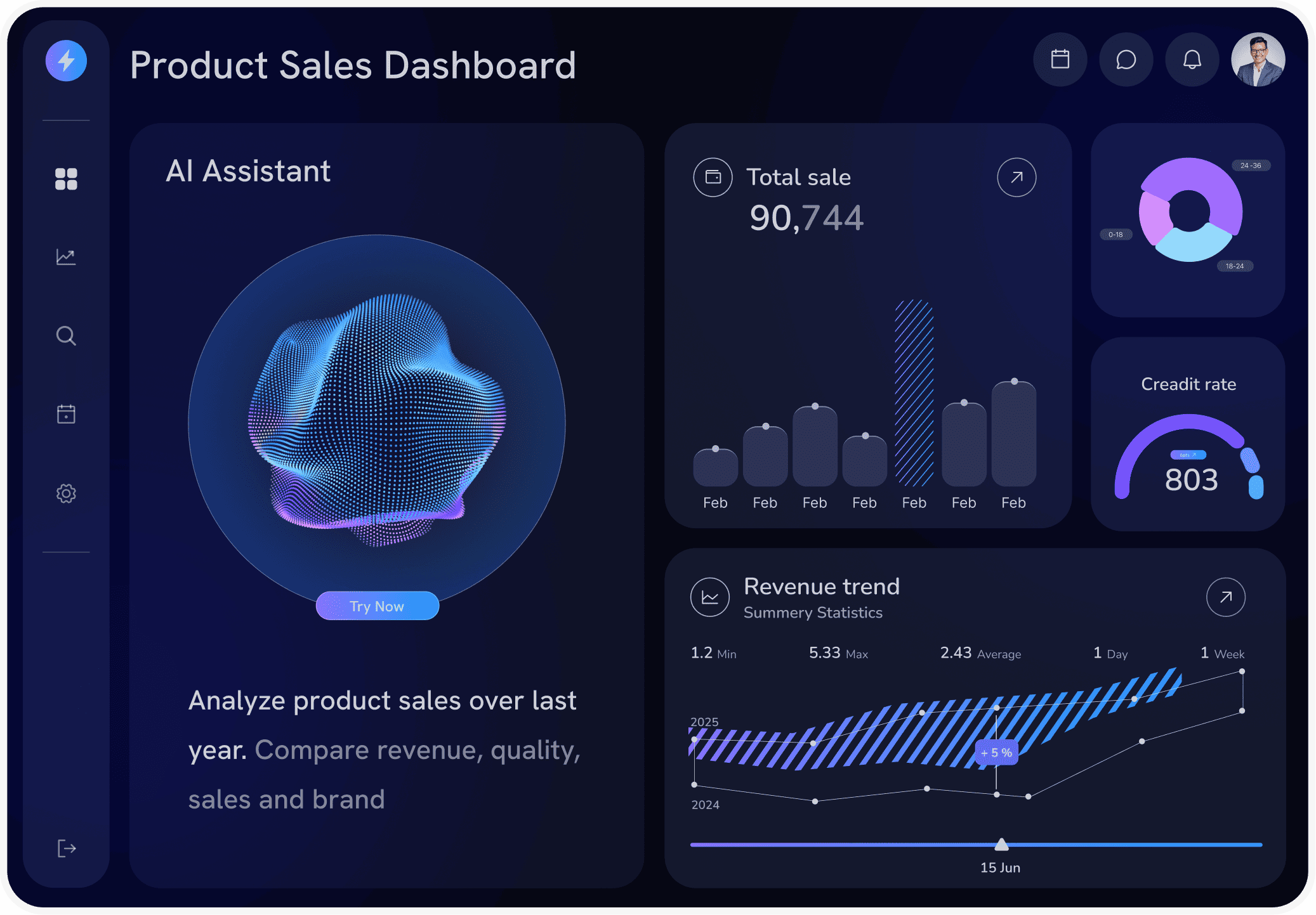
Track Revenue, CAC and ROAS in One Ecommerce Dashboard.
The ecommerce analytics dashboard for teams who need to know what changed, not just what the numbers are.
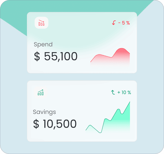
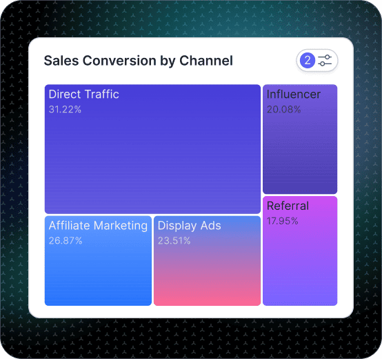
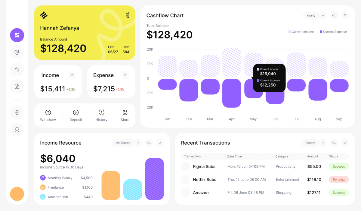
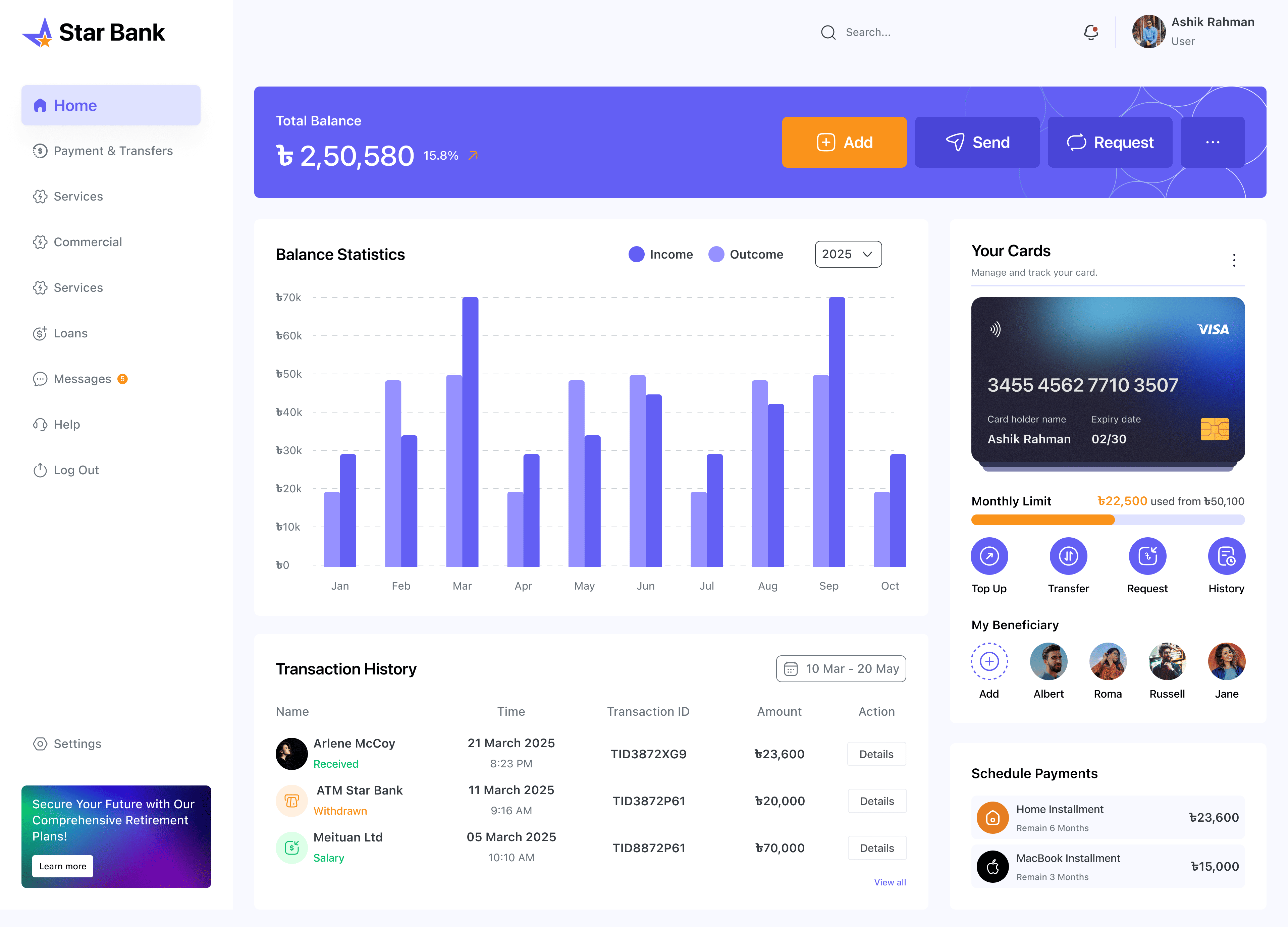
A promo can lift revenue while ROAS slips, mobile conversion can drop after a checkout change, and inventory decisions can quietly limit growth. Fusedash generates an ecommerce analytics dashboard that unifies revenue, orders, conversion rate, CAC, and ROAS in one view, so your team can identify shifts early and act with confidence. Works with Shopify, REST APIs, and any MCP-compatible data source.


.jpg)
.png)